Over the summer holidays for when I had enrolled on the second year of my course I was given the task to research different ways of typography which is going to help me prepare for my Image Manipulation and Motion Graphics unit.
A Game Logo Featuring 3D Typography Design
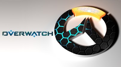
This logo is representing the symbol of the game “Overwatch”. the game itself is set in a futuristic scene and the way that the logo of the game is represented gives off that sort of sci-fi atmosphere. with the shapes giving off the different highlighted tones to show off the way the shapes are shown on the logo gives off the sort of futuristic vibe, making yourself question if a lot of things within the game will be showing off these colours, will they be repetitive within the game with the sculptures, etc. this is and also making logo look like it is just laying down on some sort of surface, but with the background with a light grey tone shows off that it is not some sort of violent game but somehow relaxing. you can also see in the logo that it is shown as a “O” for the first letter of the game, and without the orange section in the logo it looks like a “W” giving off the first 2 first letters within the game (OverWatch)
overall the style of how that this is represented is very creative and unique, nothing that normal logo designs would look like compared to Call of Duty.
A Piece Of Kinetic Typography
the link I had found with Kinetic Typography represents words giving off the visible meaning of what they represent. so if the word was to represent “Powerful” the word in the kinetic typography would show how superior it is compared to the other letter, or if the sentence would say “you have a good smile” the sentence would gradually start to bend to represent that smile. the way this presentation of kinetic typography was very creative, it was animated by ‘Kristina Netti’ who had used Audio from ‘Connor Franta’ and the animation was created for a college project (I do not own any video footage being presented of this section of my research, only for research purposes only)
A Piece Of Hand Generated Typography
This design is shown as a nursery rhyme called “little miss muffet” and the way the nursery carries on within the illustration the more the perspective with the way the words look and the images shown gives us a visual perspective on what is going on. I thought personally this would be a cool way to how off a old nursery rhyme, the illustration was created by Steph Baxter she is known for being freelance illustrator where she is based in Leeds, West Yorkshire and is known for traditionally using Pen, Paper and Ink for her work, a link to the sites I had visited will be below
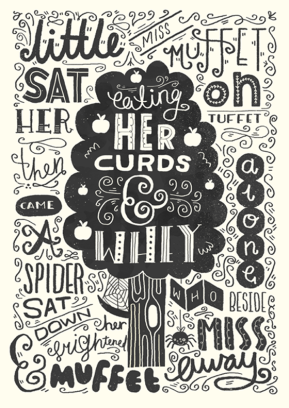
http://stylejuicer.com/design-illustration/steph-baxter-hand-drawn-typography/
http://www.stephsayshello.co.uk/projects
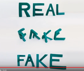
3D Motion Typography
The Image shown is from Lex Wilson who is a Typography Sculpture who uploads youtube videos of their work and the way that he has represented his work is creating words which represent the opposite meaning so Love/Hate, Real/Fake ETC, and the way he had done this is one view represents the one word and the other side of the sculpture presents the other word, which i think is very creative as it can represent a lot of meaning to people who could relate to his work, it also shows creativity which is what I find interesting as its a different way to show 3d motion typography
2D Typography
The video shown below is an example on how someone could represent sentences on the presentation of what they mean showing off images to present them. the way he had probably done this is that he used After Effects as an advantage and had planned out all his scenes before getting into the productive stage, I enjoyed watching this because of the way he had presented his examples which made the animation eye catching but also makes the viewer caught into the whole story behind this animation video. giving us important details about say businesses, etc the video I am talking about is down below
Poster Using Typographic Design
A poster which I thought I could discuss well enough to talk about this section on the typographic topic is the poster when below. The reason why I found this easy for myself to talk about is because of the way it has been structured. firstly the words shows “lets fall in love” and then at the bottom of the word love you can see that it is stretching down which is going right by a heart symbol and this can represent a few things in a positive and negative way because the sentance “falling in love” can be a good thing, or a bad thing, sadly I do not know who is what created by but I find it very creative and well structured.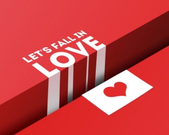
TV/Movie Which Uses Typographic Design
The film I wanted to use for this section of the topic is the classic horror film “Psycho” as it displays the text coming in at different ways and angles, for it being a very old movie it was one of the ways to present an intro to a movie in good fashion.

Or mɑybe he likes bowling.? Lee continued. ?I heard
someone say that whenever you her thunder, that means
that God is bowling in heaven. I bet heѕ actually good at
it.
LikeLike